


Critical Research Journal
Where am I up to? It is time to recap as there has been so much going on in preparation of the assignments for the Sustainable Prospects Module that I have paid less attention to organising the masses of information that is and will continue to be useful for the development of my Final Major Project. With two modules to go it feels a little early to be talking about this but as they say time flies and it certainly has with this module.
Processing
I have been mostly using Lightroom and on occasion Photoshop until recently. I still do but I have also been trying out the in-house MacBook Photos processing. It is limited but is also quick and easy to use. Overall the Adobe processing wins for control and quality but I appreciate the latter is great for prompt uploading to social media when used on the phone (I have not tried the Adobe packages on my phone).
Images
I think my ‘taking’ of images is improving and hope that others see a difference from those at the start of the course too. I ‘feel’ more automatic in the process of taking in that I seem to be subconsciously setting to camera and point from where I shoot in relation to the light and composition with greater ease and more quickly. Although this may be technique emerging there is a downside in that I will have to be more consciously aware to avoid just repeating a formula and losing creativity.
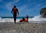
I have begun to use my iphone (a ‘darkside’ acquisition this summer some might say!) to repeat shots taken with my DSLR for comparison and also when I have the wrong lens on the DSLR say for landscapes. I have not done anything with the macros lenses on the iphone recently or invested in a zoom lens for it so that will be an experimental activity for the break.
My dilemma in the past few weeks about veering more towards landscapes that I find debris in rather then the debris itself, has been subsiding a little. I am not sure if this relates to the weather and having fewer good days to get out and about and marvel at vistas or whether it is my inspiration and understanding developing in relation to articles that I find through having learned about other artists, sculptors and photographers. It is possibly a combination of both.
I have mentioned elsewhere about endless images of debris having the potential to be boring after a while and the need to develop my own unique style of presentation. To that end I have taken that thought to the beach and got down low (in the style of Andy Hughes) and found circles ( in the style of Andy Goldsworthy). I am now feeling that further experimentation ‘in the style of various artists will be formative in aspirations for my own style or niche.


Reputation
It seems that I have a growing reputation for rubbish. I thank all of those who have through webinars and Instagram and other means directed me to artists, photographers and campaigns relating to debris and the environmental impact on land and in the sea that it is having. In the past few months the topic has escalated in interest with politicians and in the media. I cannot see and hear everything relating to it all of the time so such tip offs are very welcome and are being followed up.
Edward Weston’s iconic Cabbage Leaf (1931), Andy Hughes beach debris (2006) and Keith Arnatt who turned a mouldy loaf into a revered image (2014), all focussed in close on individual items, the former to show the natural beauty in food items and latter two achieving a raised public awareness of the environmental impact of rubbish through creating beauty in things that would perhaps be considered ugly and distasteful to focus on.
I am attempting to create some beauty with some of my finds. For example, having taken a green beer bottle in situ where I found it I then took it to the shoreline and watched it get knocked over by the incoming tide. The shimmering light on the water and through the green glass were mesmeric to watch as it slowly fell. I then put the bottle on a rock turning it around several times to see how it would look presented from different angles. Although not hugely successful in terms of correct exposure for strong light and blurriness as the bottle fell I was pleased. I have decided that I will continue to photograph in situ and experiment with changing locations for the items I find.


Other people I have been following collect and display rubbish in images as one might arranging samples from a wild flower meadow for example. This approach has resulted in huge stunning and thought provoking displays by Mandy Barker whose Plastic Sea exhibition is currently showing in Dubai (2017). Mandy Barker explains in the About section of her website that:
“The aim of my work is to engage with and stimulate an emotional response in the viewer by combining a contradiction between initial aesthetic attraction along with the subsequent message of awareness…..”.
Paul Kenny (2017) creates beautiful thought provoking images with a story. Capturing things that we often pass by in land and seascapes which we have been and should take continuing responsibility for he subtly delivers impactful messages.
Doubtful of my own creative talents I cannot at this stage see myself being able to create more than very rudimentary arrays of collected debris. It is easier to envisage just focussing on individual items. However I should not avoid a challenge as it may present opportunities in directions I cannot envisage at this moment. So onwards to further experimentation with rubbish I have collected.
Sharing and Displaying
I have written about and posted here possible outlets in terms of saleable products in an task during the Sustainable Products module. I am eagerly awaiting the arrival of some actual tangible examples. I am aware of needing to ‘exhibit’ as part of the work in future modules and have been collecting inspiration for this this activity.
In Amsterdam at the Unseen exhibition I was drawn to several exhibits with my future displays in mind. In addition I saw billboard displays on the coast near The Hague that informed passers by about the problem of debris in the oceans.
Much more research is needed in this area and my views will no doubt change with enlightenment garnered through the course, visits to galleries, communication with others and depending on the debris I find in future expeditions.
Sources
Artsy. 2017. Mandy Barker-Plastic Sea. Available at: https://www.artsy.net/show/east-wing-mandy-barker-plastic-sea. [accessed 14-12-2017].
Barker, Mandy. About. Available at: http://mandy-barker.com/about.php?gallNo=1. [accessed 14-12-2017].
BBC Bitesize-KS2 Art and Design- Andy Goldsworthy- Art. (2009). Available at: https://www.bbc.co.uk/education/clips/zh4wmp3. [accessed 14-12-2017].
Beetles and Huxley. Edward Weston’s ‘Cabbage’, an Icon of Modernist Photography. Available at: http://www.beetlesandhuxley.com/edward-westons-cabbage-icon-modernist-photography.html. [accessed 14-12-2017].
Carson, David and Hughes, Andy. 2006. Dominant Wave Theory. London: Booth-Clibborn Editions.
Goldschmidt, Michal. 2014. ‘Keith Arnatt Pictures from a Rubbish Tip 1988-9’. December 2014. Available at: http://www.tate.org.uk/art/artworks/arnatt-pictures-from-a-rubbish-tip-t13171 accessed [2/12/17].
Goldsworthy, Andy. Natural sculptures by Andy Goldsworthy. Melt. Available at: http://visualmelt.com/andy-goldsworthy. [accessed 14-12-2017].
Kenny, Paul. Home. Seaworks. Available at: http://www.paul-kenny.co.uk. [accessed 14-12-2017].
“Nobody ever discovered ugliness through photographs. But many, through photographs, have discovered beauty. Except for those situations in which the camera is used to document, or to mark social rites, what moves people to take photographs is finding something beautiful.” Susan Sontag 1977.
Following on from my discovery of Peter Lindberg I am reminded of some different portrayals of women. One thought I have relates to their portrayal as slaves to homemaking where men are portrayed as the dominant gender as in the book and subsequent 1975 and 2004 films The Stepford Wives and in the imagery of Joyce by Juno Calypso and comparing this to current social media trends. When I first saw Juno Calyso’s work at the Unseen exhibition in Amsterdam in September this year I was immediately taken back to the time I first saw the Stepford Wives. The image ‘Twelve Reasons Why You’re Tired All The Time’ (2013) was provocative and initially I felt uncomfortable. What was the point of it? What was it saying? Was it just making a woman seem like a robot? As I looked and saw that her images were of the character Joyce using equipment to make oneself more beautiful and appealing to men I began to realise my first reactions were missing the point.
What strikes me in the posted selfie images created by women and girls is that they have and are continuing to mould their self images to impress men. Some may have the intention of being chosen to promote and keep expensive products while others the need to be ‘liked’ and ‘followed’ for various reasons. Over coiffed, made up and dressed seductively are common themes to this trend. Needing to have such enhancements and adornments and the ability to take and post images in particular poses and locations seems to have become a lifestyle for some. On the negative side this can create pressures to keep up with school friends and women friends as well as lure the more vulnerable into more dangerous territory.
Whatever their personal reasons and needs are there seems to be an assumption that the ‘beholder’ only sees beauty in them if they adorn and pose in certain ways. It is this imagery that perpetuates the perception of the objectification and vulnerability of the female gender in relation to the assumed dominance of the male sex.
I often wonder about the lives of these people and how well or not the images reflect their real everyday lives. While I am sure that some are consumed by preparing for, taking, processing and posting images for much of their waking hours and some making a living out of the activity, others maybe are struggling behind the mask they portray. If, as I suspect this is the reality, their cameras lie (Hilton, 2008).
Calypso, Juno. 2017. London based photographer Juno Calypso talks about femininity and disappointment in a man’s world. Studio International. 08/11/2017. Available at: http://studiointernational.com/index.php/juno-calypso-interview. [accessed 11-12-2017].
Hilton, Isabel. 2008. The camera never lies. But photographers can and do. The Guardian. Available at: https://www.theguardian.com/commentisfree/2008/sep/27/photography.pressandpublishing. [accessed 11-12-2017].
Levin, Ira. 1972. The Stepford Wives. USA: Random House.
Lindberg, Peter. 2017. Shadows on the Wall. Berlin: Taschen.
Photoworks. 2016. Ideas on Talent: Juno Calypso. photoworks. 9 August 2016. Available at: https://photoworks.org.uk/talent-development-interview-juno-calypso/#close-no. [accessed 11-12-2017].
Sontag, Susan. 1977. On Photography. New York: Penguin.
“What makes a picture is the space between the two of you. It goes on, like a layer, over the face.” Peter Lindberg 2017.
I recently found the work of Peter Lindberg illustrated in the Times marking the publication of Shadows on the Wall (Taschen, £79.99). What caught my eye were the black and white images of well known women photographed without makeup and styling of hair in black and white. It was as if he had peeled the layers off these models and film stars who are most often seen by the public disguised as different characters in their films or styled and dressed for occasions and glossy publications. With minimal or no digital darkroom processing he shows the women behind their masks. The images for this book were selected from 37,000 taken for the the 2017 Pirelli Calendar. Looking further into his work I wanted to know whether his intentions had been and still are to show that these women are like most of us underneath their usual adornments, and/or whether he wanted to send a message to others about manipulating images to the extent that ordinary people would aspire to but never reach their level of flawless perfection, or some other reason. Of course it may simply be that he has found a niche and women of means are happy to pay what are presumably his high fees. If the latter is the case I understand he has to make a living and has made a name for himself but I veer in preference to the first two of my suggestions being his strongest motivators. I would like to see women without such means photographed in the same way. I was personally pleased to find in the interview with Susie Rushton she states his enduring intention and commitment to “free women from the artifice of airbrushing” (2017). Coming from a clinical career and being a mother aware of media influence on young minds I have witnessed the pressures and strains, and sometimes devastating effects that the desire to emulate can have. This has intensified as access to increasing forms of social media are perpetuating the trends in selfies and excessively adorned self promotion. Peter Lindberg states in his website biography, “This should be the responsibility of photographers today to free women, and finally everyone, from the terror of youth and perfection.”
Exploring his website and reading his biography revealed more about the man and his original intentions to be a window dresser, then becoming an artist before finding photography. Interestingly window dressing, if the human form is displayed, usually involves the latest fashions whereas in his portraiture of women the person not the clothes are the focus. The 2017 Pirelli calendar is an example of drawing attention to the women without the intrusion of their outerwear defining them and their stories. Stories are what he creates in his images which almost seem unadorned in their own right being in black and white. Without colour, interest in the face and what the image is saying to the viewer about the person seems to become clearer and intensifies the connection with them.
He is however also well known for his fashion photography and even when showcasing the latest for Vogue he shoots in black and white and against backdrops or on locations that can be naturally seen in shades of grey (industrial, bleak and deteriorating with few props). In these images attention is drawn to the clothes but not at the expense of the natural beauty of the models.
Having previously been a staunch supporter of colour in images I am not necessarily changing but coming to a realisation that black and white with the appropriate lighting and set in a complimentary context can be as and sometimes more, impactful for the viewer. As an experiment I decided to relook at a portrait I took in 2016 of my daughter when we were on a coastal walk. It was sunset and the light and slight breeze inspired me to try to capture her beauty in that moment. I have presented the original colour image and converted it in another to black and white for comparison inspired by Peter Lindberg’s portraits. Interestingly, I prefer the effect of the sunset on her face and hair in the colour image and the less intrusive and distracting background in the black and white version! If I look at each individually there is something about the black and white one which draws me in through her eyes perhaps more so than the colour version where there is a greater contrast in impact between the two eyes because of the orange glow of sunset on one side of her face. Thus in the former the subject (my daughter) and in the latter the light contrast on the subject capture my attention. I will need to think more carefully about colour or black and white and what might be not only a better way to depict something or someone from my point of view but also taking into account potential viewers perspectives.
Lindberg, Peter. Available at: http://www.peterlindbergh.com/press/133.%5Baccessed 9/12/2017].
Lindberg, Peter. 2017. Shadows on the Wall. Berlin: Taschen.
Rushton, Susie. 2017. Interview: Photographer Peter Lindberg. Available at: thetimes.co.uk. [accessed 27/11/17).


Portfolio
I am using Squarespace for my WIP portfolio assignments as I liked the simplicity of the pages and presentation. I have spent this past week teaching myself to restructure how the information and galleries are accessed and have got so far. I am enquiring about investing in someone to set it up ‘properly’ for me so that I can concentrate on making and presenting images rather than learning programming languages. I have invested in a student subscription as Falmouth University is approved as an establishment with Squarespace. So far the help line has been very helpful and easy to access.
https://sarah-newton-77zw.squarespace.com/
Web site
WordPress has been my initial choice for the written work for the course as it was free and recommended by tutors. Again teaching myself how to set it up I initially ran into issues and engaged help (it turned out not to be my incompetence but a glitch in the template I had chosen). Although I can post and add images I have not been able to successfully tame the galleries option in order to put my WIP portfolios there, hence having these on Squarespace. I have now subscribed to a personal account for a year to see if that helps. I hope that it gets rid of adverts that others see on my site. I have been wondering about transferring it all to Squarespace.
I remain unconvinced about Instagram and the value of followers and likes as indicators of what of my images might sell and to whom. However, on the plus side I am realising that by making it a focussed site dedicated to my research project Beauty and the Beach… I may have found a way to contribute to the rising tide of activists and more recently politicians and superstars who want to clean up our oceans for the benefit of wildlife, ourselves and the planet as a whole. I now have a strong core of followers and follow others who are active in this area. Thus one of my project goals, to raise awareness, could be achieved if people new to the movement see my images and those of others, and as a result do something, however small, in support of the campaign. I am not linked to any other social media sites.
@sarahnewtonphotography
Meeting
I am not sure who to meet with to share my portfolio or even what should be in it at this stage. I do not think there will be much interest in straight images of rubbish. There has to be something novel in the way the images were taken and/or processed. I could set up a portfolio of wildlife or plants if I could find a source of interest such as local craft shops.
Perhaps creating products rather than showing mounted or digital images would be the way to go. For example, my images of birds flying on kites, flowers decorating flower pots, rubbish and beach images on jute bags and flip flops will show what potential my images have for various products. Taking this approach I can start to see that manufacturers of such products might have an interest. I will need to do some more work on this.
Before this course I have made T shirts, calendars, photobooks and canvases, cards, hessian bags and jigsaws. Thinking about my research project images from Beauty and the Beach I have been experimenting with new ideas, some of which may become Xmas presents with a twist! A selection of beautiful images intermingled with more alarming ones but all taken with the intention of raising awareness.
I have decided that some will not be commercially viable in terms of number sold if the wrong images are used. This would include for example mugs and other food items with dirty/disgusting images on them. Perhaps I should get a range made as a test set and see what a few people think.
Because the project is about reducing and recycling rubbish I would prefer to set the images on recyclable materials. An obvious choice are Jute bags of different sizes. More difficult to find are the fabrics used for cushions covers and internal padding. Less obvious, but perhaps obvious when thought about, is beach footwear and swimwear (e.g. @DavyJ and @oceanzen_bikini ). I am not sure if Surfers against Sewage would purchase new boards with my images on them. It might be worth a try especially if they could customise them by choosing the image and sizing and positioning and if there were only a few of each image that could be used in this way (thereby adding exclusivity as photographers and artists do I in saying 1/25 for example). Although I have not yet managed to source them all yet I have made mock ups using options currently available.
Then there is the packaging to consider of course!…..


Today I became an assistant again for the second time. With Sue Brown (photographer) and Madeleine Strobel (artist and helper like me) we put up Sue’s images for her exhibition at the Devon Guild of Craftsmen which runs from 9th December to mid January 2018. Housed in a beautiful riverside building in Bovey Tracey we had a room about 15 x 10 feet with one flat wall and three solid stone and brick white painted walls. The significance of the setting soon became clear. How were we to put up several large pieces on stone and brick which was uneven and would have been challenging to drill through? Having changed Sue’s hanging plan around for fear of fixings coming loose in old mortar for the heaviest and most expensive pieces we settled on a fresh arrangement.
My steep learning curve came as Madeline opened up her tool box, an essential bit of kit for the day. I now realise that I must ask for one for Xmas if I am to be faced with such adversity and challenges as we faced today. So it has to contain a hammer, D rings, a range of screws, nails and masonry raw plugs and screws, a drill with various attachments for wood and stone and fine materials, masking tape, velcro and glue, white tack, scissors, pliers, clips to keep wires flush against walls, tape measure, spirit level, pencils, pens, paper, dustpan and brush, black rubbish bag paint brushes and white paint…..etc etc! Oh and those hanging strings with metallic hooks that can be adjusted. Most of this was used today!
The high straight lines refer to all the measuring which Madeleine was a wiz at getting the pieces to be at the right height around the room. For some of the pieces I climbed a step ladder (the height) and adjusted the string positions according to getting straight vertical lines (there were two on each of the large pieces). Everything was done to perfection including drilling to put up wooden battens on which hung the heaviest pieces and checking with a spirit level. In addition, spots where previous exhibitors had left pencil marks or had damaged the walls were cleaned and painted over in order to showcase the work against a pristine white background.
Of great interest was the range of surfaces on which Sue’s images were printed. These included aluminium, glass and backlit frames as well as traditional mounts in smaller box frames. I should have written down all the exact details but was busy up the ladder or sweeping the floor and for a time had to run out to a builders merchants to get a small extension and another length of plastic trunking which had to have a bit sawn off in the shop to fit in my car.
A brief stop for lunch with some great suggestions for photographers and artists who make various creations from rubbish for my Beauty and the Beach… project and back to work for the final leg and a brilliant result.
A full day with lots of problem solving and a great result for Sue Brown as well as being for me both a steep learning curve with an improved knowledge of straight lines and with how to work up high enhanced. So now I am off to write that letter to Santa…….

http://www.susanbrownphotography.co.uk
Andy Hughes has been recommended to me many times as people have got to know about my Beauty and the Beach… project as he has and still does create works with beach debris. He is also a leading light in Surfers against Sewage and happens to live in Cornwall, my neighbouring county. Looking for his material on line I was impressed by his website layout and the images therein. I found a second hand Dominant Wave Theory, a rather large tome produced with David Carson and illustrated with Andy Hughes images of beach debris. I understand from Instagram that he sent a copy to David Attenborough and has today posted that he received a lovely letter in thanks.
I was disappointed to have found out about Andy Hughes recent London exhibition too late to attend. I have however emailed him to introduce myself as we may meet at an event for the MA Photography course early next year. He was kind enough to reply and say that he did not require and assistant at this time (I had enquired about gaining experience with him).

I appear to be going over old ground in the sense that I have taken images and then find that others have taken similar ones a long time before mine. Andy Hughes is another example. I wonder which I should do first, instinctively take my images then read up about other photographers or visa versa. The latter way would be to sub consciously veer toward plagiarism perhaps. On the other hand armed with knowledge about composition, light and other details of settings used by the more experienced photographer I have a greater chance of taking a better shot and the potential to take a similar object or scene with a new twist as to how it was taken and/or how it was processed.
Since viewing the images in Dominant Wave Theory and on the galleries on Andy Hughes website I have begun to get down low when taking some debris as he seems to have done. This has the effect of making a very small object large in a vast landscape and it is also interesting to see the landscape providing the context from afar rather than being a focus which happens to have a piece of debris in it. One example is of a red lighter on a beach which is lit up by natural light and possibly additional lighting to enhance its colour and form.
An image that immediately stood out for me was that of Radion 1991 taken by Andy Hughes. I took an image of a Jeyes cleaning fluid can on the beach and then in grass earlier this summer just after starting the course. His image is clear and carefully set as an orange plastic container against a dark brown background. Mine is photographed as found with not enough thought given to where my focus was when taking it. It was also tin not plastic apart from the top and to my mind very old as I have not seen a can like this since I was a child. I wonder what the back story is to its arrival on this specific beach?
I took my image again on grass having risked taking it home (it still has fluid in it). I think my second image works better, although not on the beach. It makes me challenge my self-rule to date to photograph debris in situ without disturbing it (i.e. to view it in its abandoned stage where I first spotted it) rather than setting it up to showcase the item itself.
I have noted that Andy Hughes is posting examples of new works. Some images appear to have been drawn or painted on and do have the effect of drawing me in wanting to know more about the processes he is using. Maybe I will be lucky enough to meet and ask him soon.
Sources:
http://www.andyhughes.net/site/homepage/ [accessed 2-12-2017]
Carson, David and Hughes, Andy. 2006. Dominant Wave Theory. London: Booth-Clibborn Editions.


