I have found another new way of ‘reviewing’ my work. Digital photography and processing open up new possibilities for the presentation of images and their intended meanings or messages as I have begum to explore with the abstract images I have presented in a post already. I had prepared a work in progress portfolio that told a story from beginning to end both horizontally, left to right and vertically, top to bottom. It ran from beach finds through rubbish collection and recycling, to incineration for waste that cannot be recycled. A logical and neat contained story which used images I had collected in the past four months.
One tutorial and inspired self-reflection later allowed me to let go and mix things up . Apprehensive that my neatly tied up package would disintegrate if realigned (there’s another potential title I may use) and my meaning and attempt at awareness raising would melt away, I gingerly took up the challenge.There were several results.
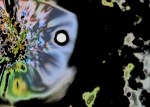
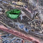
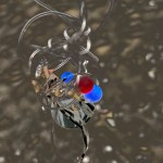
Firstly, I could see that clusters of unprocessed and processed waste and waste management images had a symbiosis through colour or shape or textural definition.
Secondly, experimenting with processing disguised some beach finds but did not entirely lose them in their new ‘psychedelic’ abstracted forms. Pleasing to me they may not be to everyone’s taste. The downside is that my intention to raise awareness and encourage appropriate waste management may be lost unless displayed with Dis-Integration and Re-Integration to clear all possible doubt about interpretation.
Thirdly, having learned about Nick Brandt’s work I tried juxtaposing two images, one of a beach find and a second of an incineration tower, I attempted to match shape and colour to give the images a complimentary ambience while maintaining a contrast which would invite viewers to ask why they were placed together.
Fourthly, although I have not combined finds I have collected into a montage yet, I have instead combined images to see if finds placed on recycling and incineration images work. This is the new discovery. I think it has potential and merits research into the use of collage in photography as well as continued experimentation with combining images.
Re-View 13
Re-View 14
Re-View15
I am not sure that my collage images would be described as other artists and photographers working in this way can be. For example, some works are likened to Dada and Surrealist movements, others to Pop Art (AnOther, 2014). From what I have read so far the work of Eileen Agar, Precious Stones (1936) appears similar to my attempts. Placing objects (precious jewels in contrast to my beach rubbish) onto a background image (in her case a profile torn from a magazine, in my case a recycling or incineration image) work in her case ”to show humour and irony” (AnOther, 2014).
Eileen Agar Precious Stones 1936
Clearly I have much more to explore in this new direction of ‘mixing up’ images. While it remains to be seen how viewers respond to these new images, I should mention there is another outcome, perhaps the most significant:
Fifthly, the story from beach debris to incineration has not been lost! I can see that I may be telling it in a different and possibly more enticing, exciting and effective way.
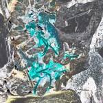
Following on from Dis-Integration and Re-Integration I have revisited Re-View, one of the original working titles for the Re-Integration collection. Discussion of one of my original layouts for the work in progress portfolio submission with my tutor, coupled with my recent foray into processing some images into what might be considered an ‘abstract’ presentation, has given birth to a third collection in which the two Integration collections can be ‘mixed up’ in the order in which they are presented providing that they they meet my criteria of not being clearly and immediately identifiable. Here is an example of two found and one incinerated items, presented as a tryptic in my work in progress portfolio as they appear to relate in form and colour.
Re-View Collection Sarah Newton 2018
Re-View, as the title suggests, encourages having another look at something. In reference to this collection it means not only that I have had another look at my images but also people who view them will take a second prolonged or closer look to uncover and ‘see’ what I have displayed. Thus from the original subject (my taking the image) to the prepared image (my re-view) to the presented image (viewers first glance) to the understood image (what it is and what it is saying in its presented format) (viewers second glance). A circular process; back to the beginning.
Desconstruction of my images, in a theoretical and not a physical sense, has been helpful in my moving onto further development in their processing and presentation. My signs and signifiers (Barthes, 1973) in the Re-View collection are not immediately identifiable. Indeed signifiers, which stimulate the contextual identification process which accords with our knowledge of how things go together in the world around us, are limited in my images. So rather than an overt connection to raise awareness, which may ‘anaesthetise’ the viewer from rising to the challenge (Williams, 2009), it appears that both my ‘ abstract’ images as well as the straightforward ones of debris and recycling and incineration plants are somewhat covert in their modus operandi. An alternative opinion may simultaneously hold true in that the message could be too ‘distant’ from the messenger (i.e. the subject in the image) requiring several cognitive analytic processes before ‘the penny drops’. Whether this approach is effective in achieving my project aims remains to be ‘seen’. Beautiful images can be received and accepted by the viewer with the emotional response initiated by the initial impact thus there is less recognition or appreciation of the need to act on the message conveyed (Sischy, 1991; Kimmelman, 2001).
Re-View 5 Sarah Newton 2018
I need to be looking at my images at several levels as one might an advertisement. After all I am wanting to promote a message just as one might market a product. These levels include the surface meaning (i.e. items of beach debris or recycling and incineration facilities), my intended meaning (i.e. the take home message to improve our waste disposal and management as individuals and corporate groups) and the cultural and ideological meaning (i.e. believing in doing all that is individually and collectively possible to safeguard and improve the way we live for the benefit of all living creatures and the long term future of the planet) (Frith, 1997, p5; Frith and Cheng, 2006). Images that link well to their title achieve greater impact than the image or title alone. Having already chosen three collections with the titles Dis-Integration, Re-Integration and Re-View, I can see that there are possibilities for exhibiting all in one location together or each in separate locations (beach, industry, gallery).
Brandt (2016) in displaying his images of animals (and parts of and petrified animals in their former landscapes), may have had similar circular intentions to mine in order to raise awareness of what the human race is doing to other living creatures on the planet. His images are clear and interpreting them just needs the viewer to note the sign (animal photographs) and make the connection with the signifiers (the context/surroundings in which the photographs are displayed). I am keen to explore how his approach would work with my project intentions. For example, displaying beach debris images on beach images actually on beaches and displaying beach debris and recycling images together on images of recycling and incineration at the sites.
Factory with Elephant, 2014 Nick BrandtFishing Lure with Incinerator Tower Sarah Newton 2018
Other examples could be to display beach debris on beach images actually on beaches and to display beach debris and recycling together on images of recycling and incineration at the sites.
Forgotten Shoe at Sunset Sarah Newton 2018Beach Debris Incinerated Sarah Newton 2018
Reviewing the work of Danny Treacy (2018) who gathers disused fabrics and clothing from skips and creates new outfits I can see what he is conveying about reuse. His images in ‘Them’ (exhibited in the Photographer’s Gallery London in 2008) do need a explanation (which is given in detail on his website) as I would not otherwise know where the clothing had come from as some of the outfits resemble clothing I have seen at festivals, on the streets of some cities and when visiting some other countries. I particularly like the way the subjects of the images are set against plain backgrounds. Following the titling of my own work his strap line for a collection could be Re-Semble (to seem) or re-Semblance (outward for or appearance) (Collins Dictionary, 2018). If this has not already been used then perhaps I will purloin it for the next stage of my photographic development.
Them Danny Treacy 2008
I have collected items I have found on beaches and waterside locations and intend develop a mini project to combine aspects of the photographic approaches of both Brandt and Treacy,
References
Barthes, Roland. 1973. Mythologies. St Albans, Uk: Paladin.
Frith, Katherine T. & Cheng, Hong. 2006. Symbolic Meanings of Advertisements in China. In Hong Chen and Kara Chan (Eds.), Advertising and Chinese Society: Impacts and Issues. Copenhagen Business School Press: Copenhagen.
Frith, Katherine, T. 1997. Undressing the Ad: Reading Culture in Advertising. In Katherine T Frith (Ed.), Undressing the Ad: Reading Culture in Advertising. New York: Peter Lang.
I have discovered something new about myself. While photographing for Beauty and the Beach… . I have allowed myself to be distracted by things I see that are not directly related to my mission. In addition, I have been discovering the capabilities of the digital darkroom, which perversely is not dark, in Lightroom, Photoshop and with Apple Photos editing. First things first, my distractions on site. It had not crossed my mind before going out that I would be as interested in containers as the subject matter, rubbish, for my project. Secondly, perhaps when a little frustrated trying to avoid clipping, distorting, over saturating colours etc. I have impulsively, or possibly in some cases mistakenly slipped with my mouse control of an adjustment bar. This has brought a sudden stop to what I was doing while I froze in disbelief that something had appeared unexpectedly and taken my breath away.
I am now researching a little more about the subject and finding artists and photographers whose styles have been described as abstract, surreal or conceptual, each of which have unique characteristics that separate it from the other two. For example, my understanding to date is that abstract expressionism is the art of showing part of something and creating an emotional response in the viewer, surrealism emulates reality and projects an intended meaning, conceptual pieces give a clear purposeful message to the beholder.
Personally influenced by Freud, Andre Breton is credited with starting the Surrealist Movement in 1924 on the publication of a manifesto. Unlike Abstract expressionists who create spontaneously, surrealist works of art are created with conscious and subconscious forethought and careful planning.The first piece considered as conceptual art, Fountain, by Marcel Duchamp (1917), preceded the pan-continents movement in the 1960s and 1970s. Conceptual art stems from the artist’s ideas and can take on many forms depending on the way the artist decides to realise their thought. As with surrealism, planning, execution and presentation is a feature (Tate, 2018).
In pursuing this research (e.g. Alegria, accessed 2018) I have discovered the work of Gerhard Richter. My photographs of containers bear a striking similarity to his paintings. Taken spontaneously and processed randomly I wonder whether my images would be considered ‘abstract’. Perhaps Gerhard Richter would use my abstract photographs (which are of physically real items) to create his abstract paintings (my whimsical and wishful thinking based on learning Gerhard Richter paints from photographs as a matter of course) (Richter, 2018).
Gerhard Richter Abstract Painting (809-3) 1994
Sarah Newton Container 1 B&W 2018Sarah Newton Container 1 Colour 2018
My image resembles a city skyline in black and white and in blue the same image could depict a boat sailing across the sea. Interestingly colour has an important place in Gerhard Richter’s work. He has completed many pieces in the form of colour charts and has had ‘grey periods’ devoid of other colours as well (Richter, 2018; Tate, 2018).
I do not think any of my images would be considered surreal although I have received a comment from a tutor with a recommendation to research the surrealist movement.The same goes for conceptual art although some of my results are considered similar to Keith Arnatt’s later work (Goldschmidt,2014).
Pictures from a Rubbish Tip 1988–9Sarah Newton Dis-Integration 5 2018
It is not that I want my work to be like or the same as other photographers. Knowing there are similarities is a double edged thing emotionally . On the one hand I could be disappointed that someone ‘got there before me’. On the other it provides a measure, against which I see that my work is developing in ways that others recognise something about my images from echoes of their knowledge and memories of the work of others. This is both flattering and encouraging and the view that I take as my learning continues.
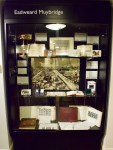
Showcased in The Bill Douglas Cinema Museum, I was inspired to read more about this man. In summary, Eadweard Muybridge is known for changing names several times, suffering a significant head injury in 1860, murdering his wife’s alleged lover in 1874 (and being found ‘not guilty’ due to justifiable homicide), moving from England to San Fransisco repeatedly with a brief time in Central America and developing a mechanical system to capture motion that has influenced the development of moving film images on the back of a whimsical and expensive bet by Leland Stanford.
Eadweard Muybridge display at The Bill Douglas Cinema Museum
Following the successful capturing of images of a running horse with 12 cameras Muybridge proved that a horse does leave the ground with all 4 legs at once. Completing this task in 1878 had taken 5 years and the result was significant not only because of the evidence in relation to running horses but particularly because Muybridge had, through his developments of camera mechanisms for the bet, taken photography to another level. Whereas motion was always a blur as an image could take a long time to complete during which all subjects and items needed to be still, with Muybridge’s adaptations the image could be taken in a fraction of a second.
Following his development of camera technology, Muybridge developed a mechanism to display moving images called a Zoopraxiscope (e.g. Chocolate Films, 2014). According to Bergen (2012), this influenced the invention of the Kinetoscope by Thomas A. Edison and William Dickson for showing motion pictures (e.g. racetocinema, 2013).
Zoopraxiscope disc used to show movement displayed at The Bill Douglas Cinema Museum
In addition to the details already mentioned he obtained two patents one for print processes and one for a machine for washing clothes and other fabrics. As well as taking thousands of photographs of animals and humans moving he also photographed landscapes in Yosemite and the growing city of San Fransisco. His work has influenced paintings, films and an opera, The Photographer, by Philip Glass.
Chocolate Films. 30 September 2014. Muybridge’s Zoopraxiscope. A Chocolate Films Production for Kingston Museum. You Tube. Available at: https://www.youtube.com/watch?v=aG5erS2GNG0. [accessed 17-04-2018].
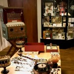
A free museum at the University of Exeter, The Bill Douglas Cinema Museum, is delightful, educational and inspirational. It brought back memories for me of cinemas of the like I attended as a child on Saturday mornings as well as developments in film from the later half of last century. Named after the film-maker Bill Douglas (1934-1991) who put together the collection with Peter Jewell, the collection goes right back to the beginnings from the 17th century. Additional items have been collected and donated in recent times. There is even an online catalogue where you can indicate what you want to see, the items being ready for you to look at, via a booked appointment, in the reading room.
An excellent and thoroughly detailed guided tour provided a tsunami of historical information which was fascinating and illuminating. I wish I could have recorded what was said as there was so much of interest to suit all ages and tastes. For me, seeing beautiful shadow puppets, intricately made magic lanterns, stereoscopes, and a camera (Moy-Bastie cinematograph camera, patent no. 4534 of 1909; serial no. 376) thought to have been used by J.B McDowell to record battlefield images in the first world war (http://www.bdcmuseum.org.uk/news/podcasts-on-our-collections/) and the use of light with conical polyorama panoptiques to radically change what the eye was seeing (e.g. from day to night, calm to disaster, neutral to political) as well as the photographs of the old cinema brands and buildings (Astoria, Gaumont and Odeon), was exciting. The architecture of these cinema houses, the grand and sumptuous interiors the fabulously smart uniforms of the staff were all designed to make film goers feel special and aspire to greater things in life.
Learning how the first panoramas and dioramas were made, the transition from silent movies to sound and colour, the production of record discs to be played alongside the running of the films were all worthy of extended periods of study in their own right. Seeing an original Mickey Mouse puppet and learning why his image was altered to look less rat-like and fearsome, becoming aware that films initially were targeted at female audiences who had time on their hands (accompanied by a plethora or female oriented film magazines adorned by the glamorous female stars of the time) with the advent of modern appliances in the home and why this focus has had to switch to a male and female younger generation were fascinating facts. The switch was made initially to compete with television and more recently current personally owned digital technology to combat the effects of a dwindling cinema audiences. Cinematic films are now marketed as having special sound and visual effects that cannot be experienced in the same way on television or hand held devices.
I apologise in advance for the poor quality of my snaps mainly taken through glass and encourage you to visit the site, view the beautifully photographed objects and listen to the podcasts about the collection. Do not miss out on applying for the available stipends to study specific aspects of cinematic history (deadline 04-05-2018).
This week we were invited to upload a video of 10 minutes duration focussing on our work in the context of that of past and current photographers with links to the wider art world and other approaches and considerations such as philosophy and ethics. I had been building up to this exercise with some trepidation. It was an opportunity to give some time to the preparation of the Critical Review assignment due in on 30th April and to gain feedback from colleagues on the course as to the value of the piece as a draft for the written critical review. I knew it was not going to be an assessed piece and that apparently only those who submitted themselves could comment on the films of others. In the end I decided to complete the task although apprehensive about my slow internet upload speed (it took 3 days before the previous film was successfully uploaded!).
I used the draft of the critical review I had been working on which was still very rough but at least it was a start. Using Camtasia again I soon found out that my written voice is not the spoken voice needed for film! Several re scripts later I had the narrative and had started to have images and text slides in mind to accompany it. First attempt was over 14 minutes …oops! The final version was still just over 11.5 minutes but I was running out of time knowing that uploading could take days so decided that was it. I chose to only use my images despite referring to the work of others. Assuming that the Critical Review would be text only which I have now found out is not true (I am glad I realised from comments received on the film and then checked with staff). I usually put a reference list at the end of my films but as this was not an assessed piece and the film was already long decided not to. Thankfully uploading went smoothly although it took about 10 hours.
Despite the pressure of completing a task when assessed pieces needed attending to I am glad I managed to submit. It has been a great opportunity to learn about the work of others and how they have approached a reflective critical review. The exchanges we have had about each others project work as well as film content and presentation have been constructive, insightful, informative, supportive and helpful in thinking about the final critical review. I summarised the points made in relation to my film for discussion in the webinar where I received additional comments from the tutor and colleagues. Re my photographs
Helicopter view of found items interesting
Add people as signifiers to the signs (i.e. rubbish)
Aesthetic or content focus or both?
Beautifully composed images
Conflict of my practice and my views on reality versus staged imagery
Show examples of the work of others
Do not use the title Re-Cycle for my second collection
Market locally near beaches
Market to commercial enterprises associated with waste management Re my film as a precursor to my written critical review
Compliments received: research and linking topics of module to my work, systematic presentation of motivation, influences and progress
Suggestions made: needs more critical depth and lateral references, explain the work of those referenced (e.g. Squires and Burtynsky), contextualise, investigate still life and surrealism, consider how digital has facilitated manipulation more than analogue.
Overall I was pleased with the reception of my film despite my omissions and running over time. The comments are all being digested (I agree with the majority of points made) and hopefully the final written and illustrated piece will address these. Now to cut it down from 4,500 words to 2,500 to comply with the assignment criteria.
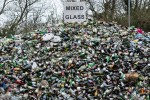
I have thought long and hard about this title. This is for my second collection. It continues the theme of Beauty and the Beach… and is linked to the beach finds in the first collection Dis-Integration in so far as it illustrates what should happen to our waste.
I wanted a hyphenated title that suggested having another look and doing something about waste. My first working title for it was Re-View and then I replaced this with Re-Cycle. Neither worked for me and this judgement was reinforced by comments received from colleagues in response to my Critical Review film shared in week 9. I have played with other prefixes and second words wanting each to stand in their own right as well as have a combined meaning that could apply to my topic and suggest an alternative way as well as link and contrast with Dis-Integration (which I and others seem quite happy with).
Here are a few I thought about:
Titles and text used with an image can be vital for the viewer to be able to read and understand the intended meaning. Some photographers name images individually while having an overall title for the collection while other stick to numbers in a series. As explained in my post on Dis-Integration I wanted a way of naming and labelling my images that suggests the intended interpretation and in this way provides a ‘dominant’ reading (Frith and Cheng, 2006) and a strengthened meaning across the collection (Gestalt. I needed to avoid an oppositional interpretation. For example, in a worse case scenario I could inadvertently present the waste management images in a less favourable light and with a less enticing descriptor than the beach debris, which could encourage leaving debris anywhere rather than disposing of it appropriately.
An additional error to be avoided is to be patronising, condescending and/or dictatorial. I find some health messages, while they have good intentions, make you turn away and ignore them either because of the way the subject of the image is presented or the accompanying text or both (Sischy, 1991). Just visiting a GP surgery can make me angry when already feeling unwell because of the blu tacked posters insisting on things I must do or not do ‘or else’ (Ludwig, 2015; Montes-Armenteros, 2015; Williams, 2009). Teach personal health and wellbeing care in schools and at home so that people grow up well versed in the messages and know what to do and what to avoid rather than trying to impose ways of behaving once people have reached adulthood by addressing them as if they were children.
Back to Re-Integration. I do not yet know what others think of this choice and look forward to comments. For me Re calls us to attention and alerts us to something to follow that will need us to focus. Integration means to become part of something, to fit in. With Dis-Integration my point is to show that the beach debris is becoming (and to a significant extent has become) part of the natural environment. So integration can mean something bad has or is occurring as well as good. With Re-Integration my thinking takes me to the concept of Gaia, specifically the Gaia Hypothesis or Theory as it is more recently referred to: a more positive understanding that reflects science and philosophy (Lovelock, 2015). However, now somewhat criticised the Gaia Hypothesis has been useful in our questioning and understanding of our planetary system. Earth is all we have. While Gaia suggests the interactions of inorganic and organic matter intertwine and recycle to sustain the planet it is clear that human behaviours in producing inorganic matter are resulting in declines in earth’s environments and climate (i.e. carbon and water cycle changes). Self-regulation is being interfered with by humans (Aitkenhead, 2016). Deforestation, air pollution and as in my project water pollution, are all upsetting the balance or homeostasis of the earth’s ecosystems.
Producing and using items that become waste is a major issue but to my mind having ways to manage it is less harmful than leaving it anywhere. So for me Re-Integration appears to link with a cycle of taking resources within the earth to make things, then returning them to the earth in one form or another, preferably one that does limited or no harm (Vinas, 2012). As research by NASA and the study of earth system science tells us this cannot go on forever as natural resources will run out.
My second choice is Re-Solution but for me solution suggests something final and complete (more so than Re-Integration) and we are far from that at this time and this may not be fully realisable anyway. So although my intention is to encourage appropriate waste disposal and management I remain despondent about the bigger picture, looking into the the future, when in the present we continue to fight amongst ourselves rather than taking the significant steps needed to modify or change behaviours as a world-wide community in order to maximise life on earth.
Frith, Katherine T. & Cheng, Hong. 2006. Symbolic Meanings of Advertisements in China. In Hong Chen and Kara Chan (Eds.), Advertising and Chinese Society: Impacts and Issues. Copenhagen Business School Press: Copenhagen.
Lovelock, James. 2015. A Rough Ride to the Future. London: Penguin Random House.
Ludwig, Michael, J. 2015. The Cultural Politics of Prevention: Reading Anti-Drug Public Service Announcements. Chapter 8, pp151-174 in Katherine Toland Frith, Undressing The Ad: Reading Culture in Advertising. Peter Lang: New York.
Montes-Armenteros, Chemi. 2015. Ideology in Public Service Advertisements. Chapter 7, pp131-149, in Katherine Toland Frith, Undressing The Ad: Reading Culture in Advertising. Peter Lang: New York.