I have just been made aware, through a friend who has visited my exhibition this week, of Paul Kenny and his publication ‘Seaworks 1998-2013’ available from TripleKite Publishers. What a great reference in relation to my project.
For more than 35 years Paul has sought “the awe-inspiring in that which is easily passed by. It contains issues of fragility, beauty and transience in the landscape: marks and scars left by man and the potential threat to the few remaining areas of wilderness. Looking at the micro and thinking about the macro, I aim for each print to be a beautiful, irresistible, thought provoking object.”
His aim is so similar to mine. However, whereas I am focussing on taking debris on beaches he is collecting organic as well as inorganic items on beaches. Another similarity is his methodology. I am just starting my adventure with no camera techniques, particularly scanning. Paul creates plates of his found items, scans and then creates large scale photographs with them (Huxley-Parlour 2018). He has also used seawater from the beaches where he took images to erode and change their appearance (Seymour, 2016).
Paul Kenny 2015, Moon-over-a-mayo-beach
Paul Kenny 2015, Precious sea metal remix
Paul Kenny 2015, Scrimshaw 2
Paul Kenny 2014, Phycology 2
I am so pleased that my images created a resonance with my friend who recommended Paul’s work to me. I plan to find out much more as I move into the Final Major Project stage of the MA Photography. The first step is to find and borrow a copy of ‘Seaworks 1998-2013’ as it is out of stock on several sites.
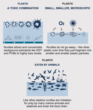
Understanding what we are talking about is a small first step to addressing the concerns these tiny, potentially toxic pieces of plastic raise (they can be coated with chemicals). Nurdles are used in the production of plastic items and bio-beads (also known as Biological Aerated Flooded Filter Media BAFF) can be used in sewage treatment plants. Many find their way into our rivers and seas through spillages and in the past, discarding excesses that way. They are small enough to be thought of as food items by birds and marine animals and we now know they are in our food chain and to greater or lesser extents in ourselves, through eating these creatures. They will not disappear.
The Nurdle Free Oceans organisation is promoting awareness and campaigning to support the Clean up Our Seas campaign with particular emphasis on encouraging industrial organisations to prevent spills in to our water ways in the first place.
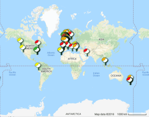
With growing awareness people are now becoming nurdle ‘hunters’ across the world identifying places where they have been found, in what concentrations and with what types of nurdle.
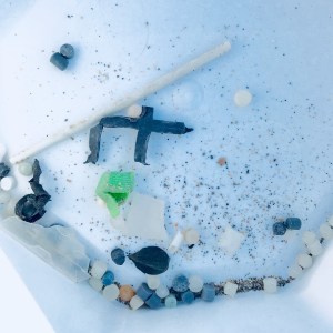
Why have I become a nurdle hunter? At a local beach clean a marine biologist working together with Surfers Against Sewage representatives explained what nurdles were, similar in size to bio-beads, and spoke about spills in South Devon rivers and sea. We were shown how to find them (and it took seconds to do so) by simply sweeping your fingers through a small patch of dry sand. I was staggered that so many, hardly bigger than a grain of sand and of different colours, some more worn than others, were found by a group of about a dozen people within minutes! It made me wonder how many people have used the beach like myself for many years and not realised the intruders were there. I understand that sources of bio-beads can be traced by virtue of their colour, as different manufacturers use different colourings, whereas nurdles are harder to trace back. I now visit the beach with a kitchen sieve and glass jar to, in a very small way, catch nurdles and bio-beads and later dispose of them carefully. I have no idea how deep down into the sand they go. I have also spoken to visiting family and friends and engaged them in hunting with me.
Clearly the pressure has to be on industries across the world and Operation Clean Sweep is the result of action being taken by the plastics industry themselves, supported by The British Plastics Federation and Plastics Europe.
I probably need to photograph them with a tape measure so that their size is apparent. Here are some I collected recently, the green top in the second image being a Smartie top I found on the beach. Hopefully knowing that gives an impression of size. I appear to have collected a mix of nurdles and bio-beads as well as a little bit of twig. I wonder if a catchy song could be composed to inform people of different ages and kick start their individual hunting activity and encourage their support for industries who are actively taking positive action to stem the flows into our waterways and oceans. After all if we want to keep buying and using items with any plastic components and we want our sewage treated we need to get behind them
BBC. 2017. Plastic ‘nurdles’ found littering UK beaches. BBC News. 17 February 2017. Available at: https://www.bbc.co.uk/news/uk-39001011. accessed 23-06-2018
3rd July Exhibition Designers announced and I am one of the three with Ant and Andrew. I am delighted to be working with these two great guys and experienced photographers (in the same cohort who I met at the Amsterdam and Falmouth course events) and really appreciate others’ trust that we will get the job done by voting for us.
For me I expected it would be a journey of discovery, challenges and leaning new things, not having done this before. The journey started straight away with needing to arrange a designers meeting through canvas and organising live webinars to inform all those associated with the MA Photography (staff and students) what our three themes are and what those who want to take part will need to send to us.
4th July meeting with Ant and Andrew to decide themes and the information we required from participants. What a great meeting to start the process. Not only did we complete the planned purpose and agenda but we also added plans for additional activities beyond the initial remit and specification for our roles.
I shared ideas I had had based on studying the five words, sentences and two images people had submitted to express an interest in taking part. These were Identity(ies)=9 Memory(ies)=8 and Transformation/Consequences=7. From these with Andrew’s ‘way with words’ emerged the theme titles.
Expressions of Consequence
Narrating Identity
Elements of Abstraction
Ant had been in touch with Gary and shared the Landings 2017 information which showed the format and potential design specification and limitations set by the webmaster. Ant’s suggestion that we have circles rather than squares for each person/theme was agreed subject to the template allowing this deviation (we later found out this was not possible). Ant also informed us that Gary had set up a Slack sharing platform through the Falmouth system for the four of us to communicate.
We also looked at Wes Anderson’s Color video by Andres Pena as used in his films (https://vimeo.com/182987900) suggested by Andrew and agreed to research more on colour combinations and ideas for those relating to the themes and background for the exhibition page. Ant directed us to a brief video of an exhibition viewed while a man was on a running machine for a minute which became a source of inspiration for our film.
We also agreed that we would ask participants for the information needed for the template; up to 14 words describing each individual’s work, a thumbnail image, name and url link to their own site where they would show their work for Landings 2018. In addition we were to ask for a ‘best of’ image that would be in each person’s exhibition that we could use to make an accompanying film, showcase in a zine/catalogue and using our designer hats judge one to be the best of the ‘best ofs’ to place on a promotional poster. Ant and Andrew suggested they use InDesign and Camtasia respectively to start work on these activities. Given my lesser competence in these areas (not knowing InDesign although I have used Camtasia) I agreed and offered myself as a port of call for the information to be returned to as I could set up a shared excel sheet for the data collection.
A great start to our working as a team with each of us contributing ideas and shaping those of each other and naturally falling into undertaking activities within our competencies that reflected the different tasks we needed to achieve.
5th July I held the first webinar for those interested in taking part. We had agreed each of us would host one to maximise opportunities for those based in different time zones and with working and family commitments to take part. Due to the proximity to the designers meeting the previous evening I did not have a well prepared presentation but did manage to post up brief notes about the themes and what we required. Unfortunately due to audio difficulties communicating well was hampered. I was also not as familiar with the operation of webinars to know that my logging out and then in again would not stop the webinar altogether. I also forgot to ask people to close down their video and mute their microphones which would have helped, an omission for which I kicked myself afterwards!. …attended.
Andrew created a page of information for participants which included our agreed clarification of the themes and this was made available at the next two webinars. I placed copies on the Surfaces and Strategies and Photography Hub pages where people were signing up to take part. We began with a sub-title in addition to the themes (following the pattern of the previous year) and dropped this following discussion when Gary pointed out it was not essential.
I have found another new way of ‘reviewing’ my work. Digital photography and processing open up new possibilities for the presentation of images and their intended meanings or messages as I have begum to explore with the abstract images I have presented in a post already. I had prepared a work in progress portfolio that told a story from beginning to end both horizontally, left to right and vertically, top to bottom. It ran from beach finds through rubbish collection and recycling, to incineration for waste that cannot be recycled. A logical and neat contained story which used images I had collected in the past four months.
One tutorial and inspired self-reflection later allowed me to let go and mix things up . Apprehensive that my neatly tied up package would disintegrate if realigned (there’s another potential title I may use) and my meaning and attempt at awareness raising would melt away, I gingerly took up the challenge.There were several results.
Firstly, I could see that clusters of unprocessed and processed waste and waste management images had a symbiosis through colour or shape or textural definition.
Secondly, experimenting with processing disguised some beach finds but did not entirely lose them in their new ‘psychedelic’ abstracted forms. Pleasing to me they may not be to everyone’s taste. The downside is that my intention to raise awareness and encourage appropriate waste management may be lost unless displayed with Dis-Integration and Re-Integration to clear all possible doubt about interpretation.
Thirdly, having learned about Nick Brandt’s work I tried juxtaposing two images, one of a beach find and a second of an incineration tower, I attempted to match shape and colour to give the images a complimentary ambience while maintaining a contrast which would invite viewers to ask why they were placed together.
Fourthly, although I have not combined finds I have collected into a montage yet, I have instead combined images to see if finds placed on recycling and incineration images work. This is the new discovery. I think it has potential and merits research into the use of collage in photography as well as continued experimentation with combining images.
Re-View 13
Re-View 14
Re-View15
I am not sure that my collage images would be described as other artists and photographers working in this way can be. For example, some works are likened to Dada and Surrealist movements, others to Pop Art (AnOther, 2014). From what I have read so far the work of Eileen Agar, Precious Stones (1936) appears similar to my attempts. Placing objects (precious jewels in contrast to my beach rubbish) onto a background image (in her case a profile torn from a magazine, in my case a recycling or incineration image) work in her case ”to show humour and irony” (AnOther, 2014).
Eileen Agar Precious Stones 1936
Clearly I have much more to explore in this new direction of ‘mixing up’ images. While it remains to be seen how viewers respond to these new images, I should mention there is another outcome, perhaps the most significant:
Fifthly, the story from beach debris to incineration has not been lost! I can see that I may be telling it in a different and possibly more enticing, exciting and effective way.
I have created a collection (see Dis-integration Work in Progress). I have not used the descriptors series or typology (Mike Perry, 2018) as the images are not in an order of significance or of one type. They are, however, of the same genus, beach debris. I chose the title and simply numbered each one as they are linked by the descriptor genus. For me, combing the two parts with a hyphen shows that there are two processes at work as evidenced in my images.
In a world where integration and equality are important I see what we are making becoming one with what has naturally occurred regardless of what it is. Anthony Hernandez found traces of human habitation with his series Landscapes for the Homeless (Smithson, 2017). Mandy Barker has also shown found manmade items, as is, but from oceans and beaches across the world. She also photographed the finds transformed, in a way that appears to ‘integrate’ them with nature and be described as new found forms (Barker, 2017).
By adding ‘dis’ to integration I am making a statement about deterioration, not dismissal, and showing the stages that some items are going through naturally, over time. In contrast, Matt Collishaw (Jones, 2013) deliberately takes apart naturally occurring creatures and poisons living plants and photographs their disintegration. Jonathan Jones described Collishaw’s art as both ”….lovely and vile. It is an art of our time and it hits true, like a bullet in the head.”. (Jones, 26 April 2013). This view resonates with me as some of my images are items that induce disgust as well as guilt and embarrassment at belonging to the human race that discards such things. However, whereas his images are beautiful and need close inspection or accompanying descriptions to explain them, mine are more obvious from the beginning and seem to be more similar to images made by Keith Arnett, including in some cases, their colours (Goldschmidt, 2014; O’Hagan, 2015; Laing, 2016). His pictures from a rubbish tip were items placed on plastic with the camera focussed on the closest edge. I plan to try his techniques and in doing so make more of the reflected diffused natural light as he has done.
Pictures from a Rubbish Tip Keith Arnatt 1988 Dis-integration 1 Sarah Newton 2018
My titling this group of images has opened a way forward for me. Immediately I thought of the concept I was able to select images that fitted the theme, both seeming to be on a road to integration while showing evidence of disintegration. A secondary effect has been to focus my attention in taking new images, thus I have shifted from taking as many items as I see, and thinking about them afterwards, to concentrating on finding and taking those that fit the theme. Of course the downside of this concentrated effort will always be that I might have overlooked potential images that could take me to a better place with the project.
References
Barker, Mandy. 2017. Beyond Drifting: Imperfectly Known Animals. Recent and Unique Species Discovered in the Cove of Cork. Overlapse: United Kingdom.
Perry, Mike. 2018. Land/Sea Solo exhibition. Mostyn Gallery, Wales, 2 March-2 July 2018. Available at:http://www.m-perry.com. [accessed 30-03-2018].
Smithson, Aline. 26 September 2017.Anthony Hernandez: Landscapes for the Homeless and Public Transit Areas. Available at: http://lenscratch.com/2017/09/anthony-hernandez/. [accessed 24-03-2018].
This week we were asked to identify a practitioner who interests us and informs our practice. I chose Mandy Barker whose work I have been impressed by and also curious about for a few months.
Mandy Barker
There are several audio and film recordings of Mandy Barker available at various events since her work on plastic pollution in our oceans caught the headlines with her work on ‘Soup’ from her time in Honk Kong and through to this year following the launch of her book ‘Beyond Drifting’ based on her time in residence in Cork, Ireland.
Mandy Barker Beyond Drifting, 2017
“The motivation for her work is to raise awareness about plastic pollution in the world’s oceans while highlighting its harmful affect on marine life and ultimately ourselves.” (Lensculture)
Mandy Barker’s images are creations made from plastic found across the world. Some are photographed using old cameras, out of date film, deliberately creating movement and using slow shutter speeds. The resultant effect is of new types of plankton, named in a latin style often with letters of the word plastic embedded within them. Each one is presented in a sphere against a black background as if a biological specimen. For example:
“OPHELIA MEDUSTICA
Specimen collected from Glounthaune shoreline, Cove of Cork, Ireland
(Pram wheel)”. (Photoworks, 2017).
Her inspiration links back to John Vaughan Thompson (1779-1847) who amongst his many discoveries identified planktons and realised their importance in the food chain. Her book Beyond Drifting: Imperfectly Known Animals (published by Overlapse in 2017) is presented in a Victorian style echoing the publications of John Vaughan Thompson other scientific researchers from the past.
Mandy Barker Echiplantus etinucs, 2017
Mandy Barker Beyond Drifting, 2017
In addition to her book Mandy has exhibited large scale installations depicting collections of themed items (such as lighters shown as a pod of dolphins and fishing debris as birds nests against black backgrounds) in public spaces outdoors as well as in galleries (e.g. San Fransisco Airport in 2017). What comes across in her interviews is a passion and commitment to use her talents to raise awareness and inspire others in order to make a difference.
Mandy Barker Penalty-Photographs of nearly a thousand soccer balls found at the beach
I am certainly inspired, but in awe of her creative abilities that at this stage seem beyond my capabilities. I would like to try out the ways she has created apparent living creatures out of inanimate plastics, not to directly copy her approach for my project but rather to extend my experiences and hopefully skill set. In addition, I collect images of all sorts of debris on beaches not just plastics and am including research on waste recycling and processing so there are fundamental differences between us. Her dedication to research, not only relating to her finds and their locations, details of which she kept meticulously in notebooks, but also to the way in which the book has been imagined, collated and presented is unique, intriguing, beautiful and impactful.
‘The way we see things is affected by what we know, or what we believe’ (Berger, 1972: 8)
Task: With your peers, you should now discuss: • The nature of the development of Trilogy. • How successful you think the edit was in each of the intent of the 3 components: Woodland, Underwater and Mountain, as contributing to this larger portfolio of work. • Any additional contextual/critical ideas you could apply to this work. • Any ideas which might contribute to the development of your own practice/critical evaluation.
“The curious truth about his pictures is that they are neither landscapes nor German……And yet this rain–soaked wood was in Scotland, that sea floor off the coast of Cyprus, this mountain in California.”. (Darwent, 2007).
Darwent suggests that the best way to consider Cramer’s ‘landscape’ photographs is as abstracts. I assume there is truth in Darwent’s revealing the locations they were taken in and that they were not constructed sets. On that basis I would argue that they are of the natural environment, of features of nature that can be identified and examined, and therefore do not fall into the genre of ‘abstract’. They are evocative in the sense that they invite enquiry creating a context that is both puzzling and enlightening.
Daniel Gustav Cramer, Woodland no. 5 (Trilogy Part 1)
I think of the Trilogy as attempting to show the bottom, middle and top of the earth. This interpretation is reinforced by the trees in the ‘middle’ often not showing the bases of their trunks or their tops. In addition the underwater images , through showing peaks and troughs that extend downwards and the mountains with sky above represent the bottom and top respectively. Perhaps this is too simplistic? Alternatively, Cramer appears to like photographing things relating to vertical structures, particularly this that convert a sense of height.
By not including recognisable reference points, objects, people or animals he encourages a focus on what is there; inviting a naked or raw analysis untainted by semantic knowledge of descriptors which would skew interpretation. We are then gleaning meaning from fictitious imagining of what is not there in order to see and feel what is there.
In considering the impact of the images and which could be excluded or should be included from the three sets I would either have arranged them in a developing sequence or removed the one(s) that were tangibly different. For example, in the underwater display of 8 images in two rows of four there is one that stands out (no 5) with a pool of light illuminating the scene (as compared to others with a rather misty appearance). I would place this at the beginning or end and then show a sequence becoming murkier or lighter depending on its position. However I can see why it is in 5th position to balance the second most lit image on the top row No. 3 and thereby make a presentable set rather than try to convey meaning and a possible story.
In looking at the images I do feel invited to speculate on what lies through and beyond each image and outside of it. By virtue of not being fully clear there is a mysticism, an untold story that maybe harks back to tales including Red Riding Hood and Hansel and Gretel as Eva Wiseman (March, 2006) observed (cited by Clarke, 2007, p87). I also see resonance with sets and scenes in films such as Robin Hood, Lord of the Rings and The Hobbit. I wonder whether Cramer was influenced by the German fairy tales in his decision to make these images and the way he has photographed the locations?
Three things struck me while thinking about Cramer’s work in relation to my own. Firstly, since starting to take images as a teenager I have taken landscape scenes with a near reference point and a depth effect, looking into and through the image. I noted this in a previous module exercise.
Carole by Sarah Newton c1970
Secondly, I have recently taken some images where lighting and air pollution, for me, have resulted in adding an atmosphere to the images.
Sarah Newton 2018
Thirdly, I have more recently in the last module, tried putting images together as a tryptics with a common subject or theme (https://sarah-newton-77zw.squarespace.com/new-gallery-3). Whilst not in sets that form a trilogy as Cramer presented I am encouraged to experiment further with ways of presenting that may convey greater meaning than individual images alone.
In conclusion, although not instantly ‘taken’ by these images the more I look at and into them the more I construct my own narrative for each one and all (i.e. the whole set) at once, as if I am piecing together a sequence in a film where there is a search for light and clarity. Absorbing nature and time in one go.
References
Berger, John. 1972. Ways of Seeing. Penguin Books: London.
Clarke, Michael. 2007. Verbalising the Visual: Translating Art and Design Into Words. Worthing, Sussex: AVA Publishing.
To represent is to aestheticise, that is, to transform. It involves a vast field of choices but it does not include not to transform, not to change or alter whatever is being represented’ (Levi Strauss, 2003: 9). Task: • Research and share on this forum, a particular body of work / exhibition / advertising campaign / coverage of a news event etc. which aims to convey a particular message. Ideally, this should be relevant to your own practice. • Identify the message the work aims to promote and who you think its intended audience might be. • Post to this forum a short critical outline of your own response to the relative success of this work in achieving its intent. • Consider, highlight and respond to any key ideas raised by Sischy (1991) that you particularly agreed or disagreed with. • Define and evaluate how these practitioners achieve this? (or not?)
“It is work that is sloppy with symbolism….it feels as if the artist’s work is being worshipped instead of examined.” (Sischy, 1991, p90).
In speaking about the intentions of photojournalists Sischy (1991, p91) notes how few have succeeded in calling people to action “Others have simply been naive-even deluded-about what they were doing. Still others are complicated mixtures of high aspirations and presumptions. It seems to me that Salgado is one of these.” I think I am one of the former with my project work.
Referring to Salgado’s quest for beauty and respect in his image composition Sischy (1991, p92) notes “And this beautification of tragedy results in pictures that ultimately reinforce our passivity toward the experience they reveal. To aestheticize tragedy is the fastest way to anaestheitize the feelings of those who are witnessing it. Beauty is a call to admiration, not to action.”.
In contrast Walker Evans photojournalism is “straight” and “naked” as noted by Lincoln Kirstein and quoted by Sischy (1991, p93). Perhaps like my in situ images, showing the subject as it is in its raw found state. Whereas my more creative compositions and manipulations in front of the camera and in the digital darkroom are possibly more in the style of Salgado. One example which illustrates this split approach is to be found in an image I took of a dead seagull. Either I could post this as is and perhaps upset some on instagram or I could make it into a creative image that retains the curious sight of the viewer for longer and is less likely to garner upset or angry comments from those who found the alternative distasteful. However as I do not know how it died and whether it was natural causes it may not be appropriate to post it on a site focussed on the damage to creatures from our waste.
Speaking of the challenges of using photographs to draw attention to suffering in the world Kimmelman noted:
“Photographers deal with this problem differently, but above all by struggling to make beautiful pictures: what causes any image to stick in the mind, aside from shock content, whose impact tends to be brief, are qualities like pictorial integrity and compositional originality, which are fancy terms for beauty. If your subject happens to be the dislocation of people and their suffering, then those people and that suffering become your compositional devices.” (Kimmelman, 2001).
I would suggest that both Salgado and Brandt have similarities in approach in that they take beautiful images, both with haunting qualities that remain in your consciousness, both in black and white, both to do with making the earth a better place to live on for all future generations. The differ, however, in how the images were composed and contextualised with Salgado’s images suggesting ‘this is how it was found’ and Brandt openly making available how he constructed his images and decided on the locations for them. He photographs animals whose habitats have been disappearing through the actions of mankind, transports and positions them in the transformed landscapes, to be taken as a final image for his collection Inherit the Dust.
My emotional responses to the images of both Salgado and Brandt differ when thinking about their impact in raising awareness which both photographers are reported to have intended with Genesis and Inherit the Dust. Maybe that has something to do with the plight of the subjects in the images: people (Salgado) versus animals (Brandt). Maybe is is to do with time, Salgado’s images come at a time when we are subjected to many images and films of people in very poor health in far off places and we may have become anaesthetised to such images.
Road to factory with Zebra, 2014 Nick Brandt
I think Brandt’s images are more powerful for me because they directly confront the changes that we have made to environments, many of which will have dreadful consequences for life on earth unless action is taken. While Brandt’s images are to be applauded for their compositional arrangements (e.g. such as the giraffes being juxtaposed against a background of cranes, the zebras being confronted by a train with stripes on the front and the hills lined up with those in the original images) there are interpretations possible that he might not have intended. Most, if not all, the images repeat the story of lives in poverty, possibly ad hoc/chaotic industrial and domestic building and an inability to manage waste. Thus Brandt seems to be delivering several messages which could place his venture at risk of overwhelming the viewers as there is so much to accomplish or because his ‘point’ or ‘purpose’ is missed and viewers are not tempted to ask why the work has been presented in this way.
In discussing environmental activism through photography has made me reflect not only on my work to raise awareness of debris in the sea and on beaches but also that of others who have made films about the waste problem we have across the world. Lay (2016) presents an easy to understand film about the Pacific Garbage Gyre and mentions Boyan Slat (2017) at the end as the person to clean up for us. For me this suggests that this is the only solution to the complex problem. While Slat and his Dutch company will be starting work on one gyre this year, there is much more to be done than collecting waste that has already been inappropriately discarded. Unless I have missed some information, The National Geographic 2016 film on the same topic also stops short suggesting that good farming practice is an answer to improving health and the environment. Both A Plastic Ocean and Plastic Ocean have more ‘punch’ in that they are at times shocking, films but also clearly present facts as well as potential solutions. The former being made by Plastic Oceans Foundation and endorsed by David Attenborough (Heaver, 2016). and the latter produced by the United Nations.
A Plastic Ocean, Plastic Ocean Foundation, 2016Plastic Ocean, United Nations, 2017
What have I learned with this brief sojourn into aesthetics and impact in relation to addressing environmental issues? I am agreeing with Sischy (1991, p92). Beautiful images depicting concerns and plights have a place and can go so far with raising awareness but greater impact may be achieved with showing ‘it’ as it is and adding a visual narrative such a the contrast of background and subject in Brandt’s images and the two Plastic Ocean films. The use of text and speech in these films is more effective than either gentle or abrasive music which either minimises the problems or confronts the viewer head on in a challenging and potentially alienating way.
In relation to my work I will need to think about impact, not just for the course but also for the cause. Taking Brandt’s idea I wonder what response I would get placing huge billboards of my images of rubbish found on beaches on the beaches…?
And I have known the eyes already, known them all, The eyes that fix you in a formulated phrase, And when I am formulated, sprawling on a pin, And I am pinned and wriggling on the wall, Then how should I begin? T S Eliot (1915) The Love Song of J. Alfred Prufrock
Susan Sontag (1977: 155) accuses photography of being ‘acquisition’ and the ‘surrogate’ possession of the object. One that ‘means putting oneself into a certain relation to the world that feels like knowledge and therefore, like power’ (ibid: 4).
Task: Post a short message that outlines your own ethical position regarding the inherent power relations involved in photographs. • Outline the key ideas raised by Grundberg (1988) that you particularly agreed or disagreed with. • Provide visual illustrations – including both negative and positive stereotypes. • Evaluate how these practitioners do or do not achieve their goals.
Grunberg’s article was interesting to read. Grundberg presented the history of the publication and the journey it has taken from being “a dry, scholarly 19th century journal for geographers into a popular magazine” (Grundberg,1988). I do agree, though not having seen it myself, that the exhibition “Odyssey: The Art of Photography at National Geographic”, might have been better received (at least by Grundberg) had the images been curated to show the development of the magazine over time.
It is clear that the images are deliberately aesthetic and appealing in style and that this is the foundation on which it has expanded readership and made commercial gains over time. I have enjoyed growing up seeing the images of far flung places, peoples and creatures of the world and learning about events and dilemmas such as volcanic eruptions and near extinctions raising awareness for campaigns to save whatever it is from disappearing from earth. Indeed such images from this and other publications stimulated my interests in geography and anthropology, and my choosing to study the latter at college.
I do agree with Grundberg that constructed and staged images which do not portray the actuality of a scene or situation and therefore mislead the reader are to be deplored. I think there are degrees of misleading with an extreme being brainwashing the result of which is to totally convince others of a supposed “truth”. There is evidence that this continues to occur today. Our dynasties, empires, colonies and commonwealths of the world may change shape and size over time but there remains a core of patriotism and loyalty that drives the tenor of information fed back and recycled within that specific and unique culture. To that extent I think that all publications written and broadcast require careful consideration and reflection by the reader and viewer in order to be able to have an ‘own culture’ as well as ‘our world’ balanced understanding and respect for differences.
One example of many is to be found in the way in which Yosemeti National Park was portrayed in the 1920s and 1930s, with displays of might and power evident from the huge mountains and vistas within the images, little or no human or animal life included and widespread promotion as a place to visit being representative of white mans conquering power of this landscape. Ansel Adams made his name as a photographer with his images of Yosemite (e.g. Cain, 2017; Schama, 2018; Turnage, 2016). The indigenous populations having been cleared submissively to other locations. To that extent I agree with the statement made by Sontag (1977, p155) above and the following:
“The photographic exploration and duplication of the world fragments continuities and feeds the pieces into an interminable dossier, thereby providing possibilities of control that could not even be dreamed of under the earlier system of recording information: writing.” (Sontag, 1977, p156).
Together writing and photographs in National Geographic and other illustrated media about the world create significant power and influence over readers and viewers understanding and consequent opinions.
By coincidence with this course activity National Geographic has published its April 2018 edition focussed specifically on racism to coincide with the 50th anniversary of the assassination of Martin Luther King. Susan Goldberg, Editor, said ”…It ignored non-white Americans and showed different groups as exotic or savage, propagating “every type of cliché”…”. (BBC News, 2018). She commissioned Associate Professor at the University of Virginia John Edwin Mason to examine past issues and concluded “National Geographic had served only to reinforce racist attitudes in a magazine with “tremendous authority”. He showed that until the 1970s the magazine ignored non-white Americans, only showing them as labourers or domestic staff.” (Mason, 2018, p….). Greenberg (2018) also commented on this work noting Mason’s finding that non-white people were exotic and savage. Thus Grundberg’s 1988 analysis 30 years ago of the racism and the image of white supremacy conveyed in the photographs has been vindicated. It will be interesting to see what changes are made to the specifications given to commissioned writers and photographers and what is published following the April 2018 edition.
Schama, Simon. 15 March 2018. Ansel Adams. Civilisations: Series 1, Picturing Paradise. BBC 2 Clip. Available at: http://www.bbc.co.uk/programmes/p0612xf6. [accessed 16-03-2018].
Sontag, Susan. 1977. On Photography. London: Penguin Books.
Turnage, William. 2016. Ansel Adams, Photographer.This biography was published by Oxford University Press for its American National Biography. Available at: http://anseladams.com/ansel-adams-bio/. [accessed 16-03-2018].
Susan Sontag (1977: 174) gave the following description of photography: ‘Photography does not just simply reproduce the real, it recycles it, a key procedure of a modern society. In the form of photographic images, things and events are put to new uses, assigned new meanings’. Task: • Reflect on the contexts which are open to disseminate photographs today, eg, print portfolio, book, magazine, Internet, zine and gallery. • Provide specific examples to support your comments. • Evaluate their success or failure. • Outline how each context might ‘assign new meanings’ to the work. • Identify and reflect on ways in which this might inform the optimal context for viewing your own practice.
The list of possibilities for presenting photographs is endless. In addition to galleries and printed reading materials the internet has many ways of communicating including via social media. Then there are consumer products and publicity on public transport of all kinds including, on occasion, colourful advertising logos and messages in sky trails.
The history of war posters provides examples of enduring messages that are well known today. Eric Field was commissioned in 1913 to design a poster to encourage signing up to the armed forces. This was published on 5th August 1914 the day after Britain declared war on the German Empire. Lord Kitchener in his capacity as Secretary of State for War was in charge of recruitment of soldiers to fight Germany. He noticed Field’s advert and a group of ‘ad men’ were pulled together to come up with recruitment publicity. Ultimately it was Alfred Leete an illustrator with the firm Caxton who adapted Field’s concept and designed (following several versions) the more familiar Lord Kitchener wants you poster.
Alfred Leete 1914Eric Field 1913Committee of ‘ad men’ 2014
Copied in recruitment advertisements by many countries Leete’s design is thought not to have been the most widely used or effective during the war. Rather the one designed by the committee of ‘ad men’ is considered to have been more effective. However it remains Leete’s design that has inspired a plethora of imitations for a multitude of purposes.
A somewhat similar story seems to have occurred with designs for posters during the second world war. They were intended to boost morale and one in particular was saved to issue in the event that Germany invaded the UK. This was the well known Keep Calm and Carry On poster designed by the Ministry of Information. As Germany did not invade, thousands of copies of this poster were pulped and any remaining copies are now considered collectors items (BBC News, 2010).
Ministry of Information 1939
The Keep Calm and Carry On official and licensed store (one of many selling associated products) has many products based on the original poster from posters to iPhone cases, soft furnishings and mugs. You keep the Keep Calm text but can tailor the rest of the wording and the colours in the poster to suit yourself. So although not used in the war it has become very popular since. It’s use in more recent years appears to have coincided with the increased recognition of mental ill health and the need for people to receive wellbeing, moral boosting and empowering messages in daily life. Interestingly this resounds full circle with the original intention of this and other posters!
In my own practice I am at times torn between observing and photographing animate and inanimate things when seen and constructing situations or scenes when taking and/or processing images. I wonder which approach will serve me best. I think the former is for my personal memories to be kept to myself or shared with a few close relatives and friends and the latter is where I feel I am being encouraged to go for at least six reasons. Firstly, the MA Photography course is spurring me onto openness through experimentation. Secondly, I want to see how far my abilities in the creative sphere can go. Thirdly, I want to becomes more technically competent both in the taking and processing of images. Fourthly, I am now aware of the thousands of others who post photographs on social media of a very similar nature and style to myself. Fifthly, I would like to be able to show my work more publicly and to do this need be able to put together a collection that is worthy of such airing. Sixthly, although I may be making a small contribution through Instagram to the campaigns to clean our rivers, seas and beaches I need to see if there is a more impactful way I could contribute.
I have already experimented with having products made adorned with my images of beach debris and/or seascapes. These include jute bags, flip flops, jig-saws, cushions and canvases for the wall. So far given as gifts, I do need to see if I can source more sustainable materials and diversify the product range before moving onto marketing. One opportunity may arise later this year with a suggestion that in the next module we will be encouraged to exhibit. My exhibition could include these products as well as framed images and possibly a pamphlet or small book. What I am not necessarily seeking nor likely to get is a name for myself as a photographer with my chosen project Beauty and the Beach… (there are so many images available in this area and I feel mine are not unique). However, as with the war photographers whose names do not appear on all the products from their original designs I would be pleased if some of my images were to be used in furtherance of ‘the cause’.
Sarah Newton 2018
“What makes something interesting is that it can be seen to be like, or analogous to, something else. There is an art and there are fashions of seeing things in order to make them interesting; and to supply this art, these fashions, there is a steady recycling of the artefacts and tastes of the past.” (Sontag, 1977, p175)